- Register a toolbar button in NOTE/DOC
- Register a lasso toolbar button in NOTE/DOC
- Register a text-selection toolbar button in DOC
Create a Plugin Project
A plugin project is essentially a React Native project. We recommend creating it via the community CLI withnpx (usually no global react-native-cli is needed).
If you have previously installed an older global react-native-cli (or global react-native), uninstall them first to avoid scaffold version conflicts:
project_name is your project name. You can replace it with your own; keep the other arguments unchanged. Example:
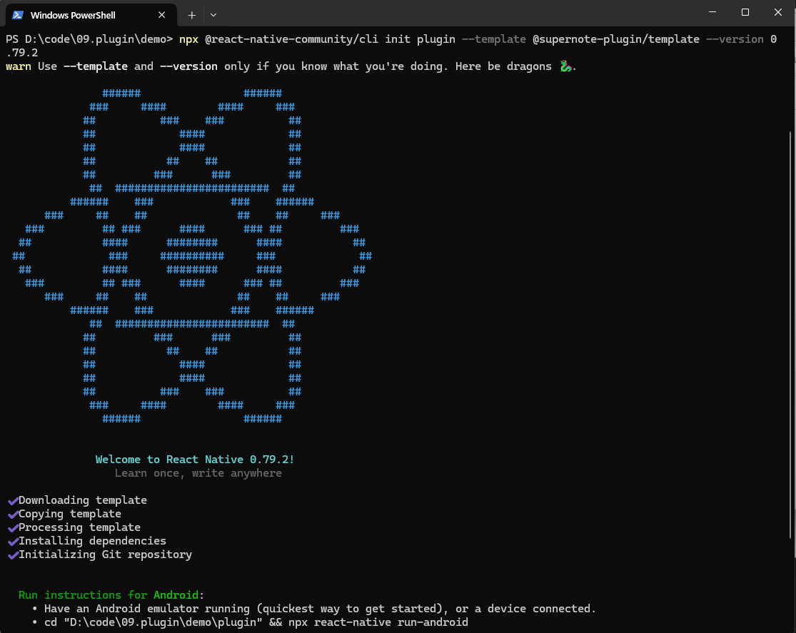
The plugin framework uses React Native
0.79.2. Your plugin project must use the same version; otherwise it may fail to run or be incompatible with the host.plugin folder will be created in the current directory. The structure looks like:
index.js: plugin entry (initialization + button registration)App.tsx: plugin UI entry (React component)package.json: dependencies and scriptsandroid/: Android native code (when you need native capabilities)buildPlugin.ps1/buildPlugin.sh: plugin packaging scripts
sn-plugin-lib). Import APIs in code via import ... from 'sn-plugin-lib'.
Plugin Initialization
After creating the project, two key files are generated:index.js and App.tsx. They come from the template @supernote-plugin/sn-plugin-template.
index.js is the React Native entry and also the plugin entry. Plugin initialization must run here. You must call PluginManager.init() first; otherwise other plugin APIs will not work.
PluginManager.init() is called after AppRegistry.registerComponent(...) to complete initialization.
The rest is generated by the React Native template: AppRegistry.registerComponent(...) registers the UI entry component App.tsx.
Button Registration
Plugins support three entry buttons:- Toolbar button: shown in NOTE/DOC toolbars
- Lasso toolbar button: shown after the user creates a lasso selection
- Selection toolbar button: DOC only; shown after selecting text in a DOC
Register a Toolbar Button
Toolbar buttons must be registered inindex.js, and must be called after AppRegistry.registerComponent(...) and PluginManager.init():
PluginManager.registerButton(type, appTypes, buttonConfig) takes three arguments:
type: button type.1toolbar,2lasso toolbar,3selection toolbar (DOC only)appTypes: supported app types array:NOTE,DOCbuttonConfig: button properties:
showType=1, tapping the button opens a full-screen container in PluginHost and renders the plugin UI.
When showType=0, no UI is shown; the plugin still receives the button event and can run background logic.
After packaging and installation, NOTE/DOC will show a plugin entry button in the toolbar:
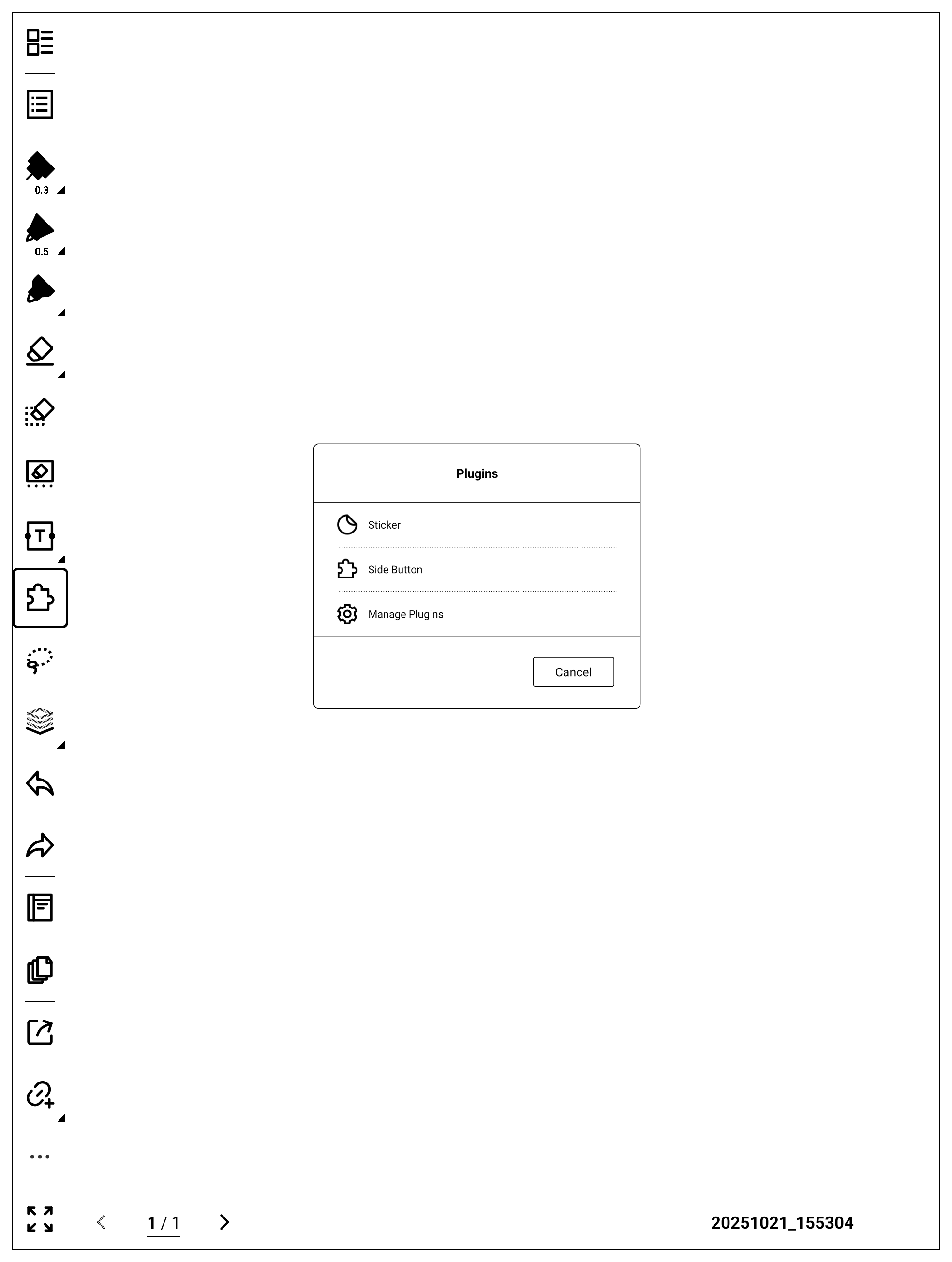
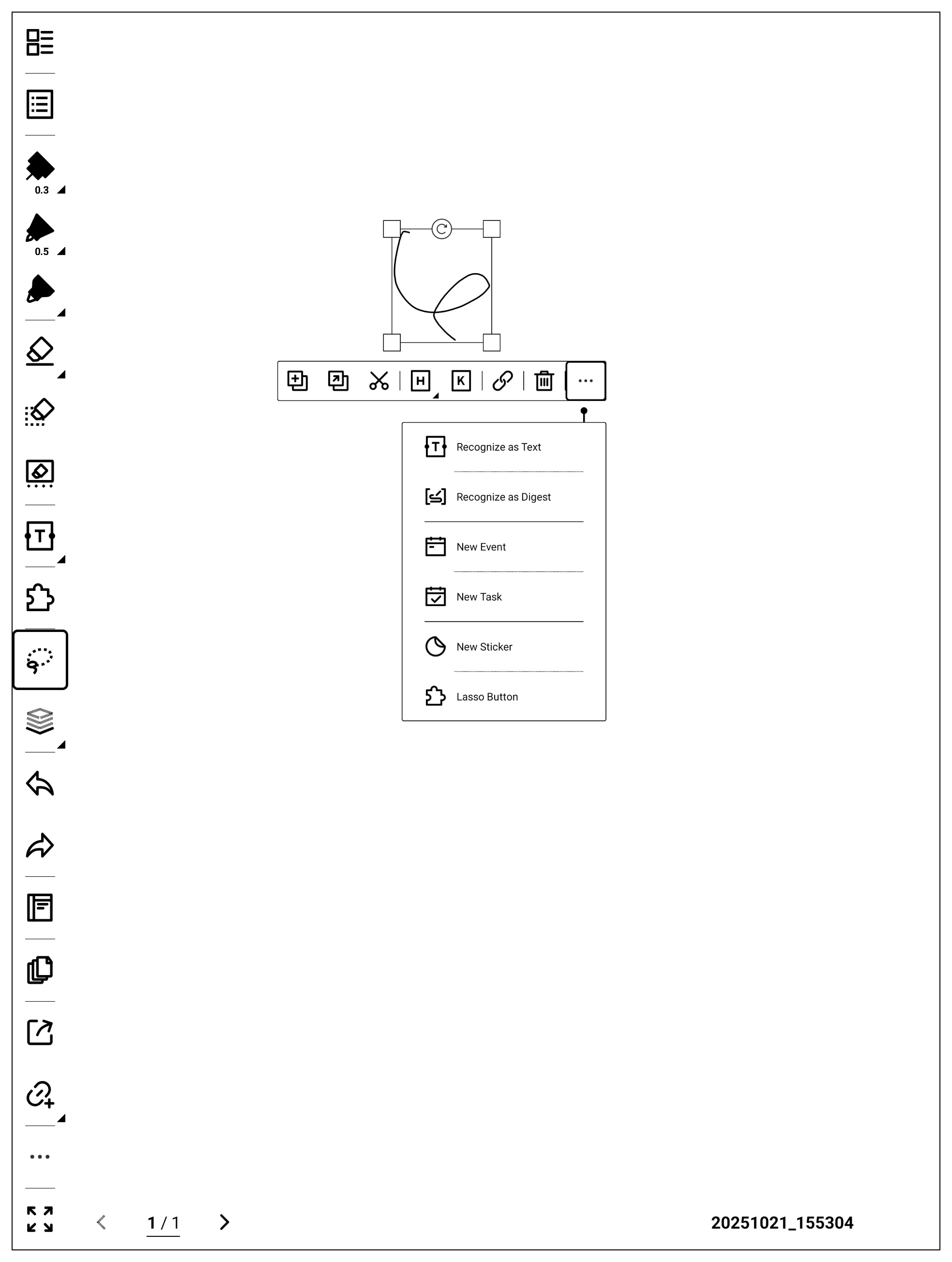
Register a Lasso Toolbar Button
Lasso toolbar buttons are also registered viaPluginManager.registerButton:
type=2 to register a lasso toolbar button.
Compared to toolbar buttons, lasso buttons add editDataTypes:
editDataTypes to control when the button should appear.
After packaging and installation, “Lasso Button” will appear when lasso selection is active:
Register a Selection Toolbar Button
Selection toolbar buttons are DOC-only, and are also registered viaPluginManager.registerButton:
type=3 to show the button in DOC’s selection toolbar:
Implement the Plugin UI
App.tsx is the UI entry component. The template provides a simple “Hello World” UI you can modify:
App.tsx.
The default App.tsx shows “Hello World” centered on a white background:

Package the Plugin
This section describes how to build a plugin package. The template includes two packaging scripts:buildPlugin.ps1 (Windows) and buildPlugin.sh (Linux/macOS). Run the script from the project root.
On Windows:
PluginConfig.json is generated in the project root:
PluginConfig.json is the plugin configuration file. It is generated only on the first packaging run; you should maintain it afterwards.
After packaging, a
build directory is created:
generated contains intermediate artifacts. The final plugin package is build\\outputs\\plugin.snplg.
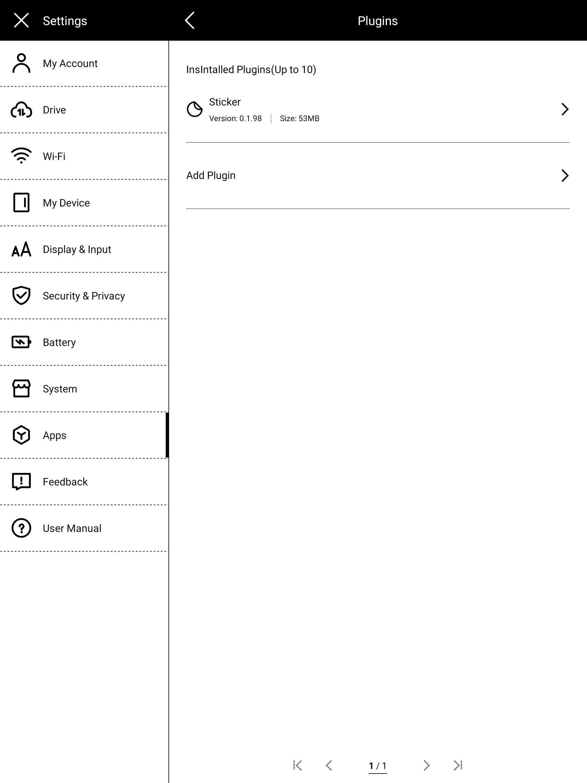
Install the Plugin
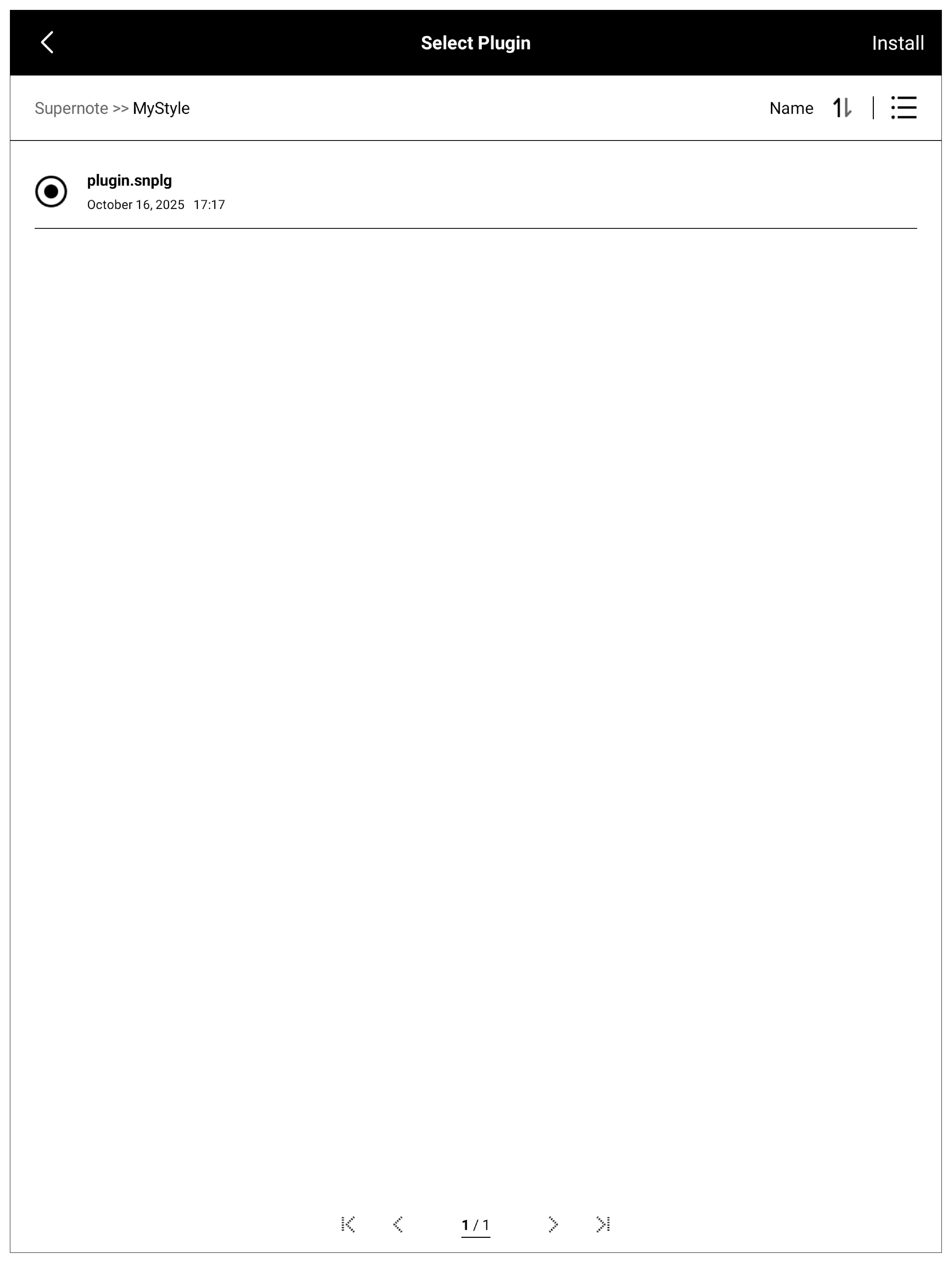
Copybuild\\outputs\\plugin.snplg to the MyStyle directory on your SuperNOTE device.
Then open “Settings -> Apps -> Plugins”: